In this tutorial, we will look at one of the most popular UI library for Tailwind and React.js ecosystem : Shadcn UI
Starting with what is it? how to install and use shadcn components in your project. Let’s start exploring.
What is Shadcn UI ?
Shadcn UI is a collection of react and tailwind components. One of the benefits of these components are they are not a dependency, they are pre-designed and coded react components just like your other components.
Example code of a ShadcnUI input component :

After you add a shadcn component to your project, than you can import these components like your react.js components and use them in your project.
Example usage of ShadcnUI Input element in your code :
import { Input } from "@/components/ui/input"

function MyComponent(props){
    return (
    <div>
      <label> Enter you name </label>
      <Input />
    </div>
    )
}
Using Shadcn/ui with Next.js
Let’s use these components in a next.js project.
Create a new next.js project
Create a next.js project with this command and make sure say yes to tailwindcss.
npx create-next-app@latestI will create a Javascript project with App router.
Note : But I suggest you to always use TS in Next.js and ShadcnUI projects
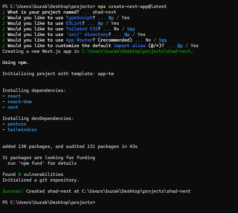

After these steps you can open your project in code editor like vscode
Initialize ShadcnUI in your next.js project
Now run this cli command below to setup Shadcn
npx shadcn-ui@latest initIt will ask you some questions to configure default theme and styles.
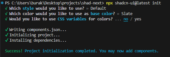

After these steps you are ready to use shadcn components.
Adding a shadcn component in your codebase
Now setup is done, we can add any shadcnui component we want.
I will add a Button component but you can select another component from here => ShadcnUI Docs – Components
npx shadcn-ui@latest add buttonAfter you run this command it will create a Button react element in your components folder. You can open the file and see it is just a react component with tailwind styles applied
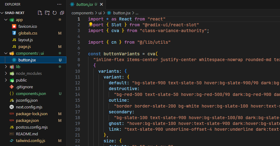

// Rest of the code above
const Button = React.forwardRef(({ className, variant, size, asChild = false, ...props }, ref) => {
  const Comp = asChild ? Slot : "button"
  return (
    (<Comp
      className={cn(buttonVariants({ variant, size, className }))}
      ref={ref}
      {...props} />)
  );
})
Button.displayName = "Button"

export { Button, buttonVariants }
Use shadcnui component in your code
Now import Shadcn button and add it to your page to test it.
Notice I’m using @ symbol for imports, when you init shadcn it will add @ shortcut symbol. This symbol references your base project path.
So @/components path is basically same thing as ./components


Open your localhost development server and you can see the button component!


Edit theme in shadcn components
There are two ways to edit shadcn elements in your project.
Edit just one element
Let’s assume you add a <Button /> shadcn element to one of your page. Just edit the classname and write your tailwindcss classes.
This will only edit the imported button element. Other shadcn buttons will stay the same.


Edit base shadcn element
For example after you add shadcn Input element, you want to edit it’s style so every input element in the project will look the same.
To achieve this you need to open shadcn element file first from you ui folder.


After you open, find the className prop of element. You will notice there is function called cn(). This helper function will merge the tailwind classes.
Add your preferred tailwind classes as the first argument of cn() function than put a comma.
It should look like this code below :
// I added bg-blue and text-white classes to Input element
<input
      type={type}
      className={cn("bg-blue text-white",
        "flex h-9 w-full rounded-md border border-gray-200 bg-transparent px-3 py-1 text-sm shadow-sm transition-colors file:border-0 file:bg-transparent file:text-sm file:font-medium placeholder:text-gray-500 focus-visible:outline-none focus-visible:ring-1 focus-visible:ring-gray-950 disabled:cursor-not-allowed disabled:opacity-50 dark:border-gray-800 dark:placeholder:text-gray-400 dark:focus-visible:ring-gray-300",
        className
      )}
      ref={ref}
      {...props}
    />

